반응형

스위치(Switch)는 두 가지 옵션(상태)을 표시하는 버튼이다.
이와 유사한 UI에는 토글 버튼, 체크 박스가 쓰일 수 있다.
Switch 주요 속성
- android : showText - on/off (설정/해제) Text가 보일지 안보일지를 결정하는 속성.
- android : thumbTextPadding - Switch Caption과 Thumb 사이의 간격
- android : switchMinWidth - 스위치의 너비 최소 크기
- android : switchPadding - Switch Caption과 스위치 사이의 간격
- androiid : switchAppearance - on/off Text의 Style 지정
- android : textOff - off 상태일 때 표시될 Text 지정
- android : textOn - On 상태일 때 표시될 Text 지정
- android : textStyle - Text Style(bold, italic, bolditalic)
- android : thumb - 사용자 드래그를 통해 on/off 설정이 가능하도록 하는 thumb 모양
- android : thumbTint - thumb에 색상 지정
- android : track - track 모양 지정
- android : trackTint - track에 색상 지정
Customizing
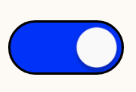
그림과 같은 Switch버튼으로 customizing을 해보겠습니다.
android : track - drawable 파일 생성
switch_track_on.xml
<?xml version="1.0" encoding="utf-8"?>
<shape xmlns:android="http://schemas.android.com/apk/res/android"
        android:shape="rectangle">

    <solid android:color="#0b27ff" />	 <!-- 테두리 내부 색상 설정 -->

    <!-- 테두리 내부 여백 설정 -->
    <padding
            android:bottom="5dp"
            android:left="2dp"
            android:right="2dp"
            android:top="5dp" />

    <!-- 테두리 설정: 두께, 색상 -->
    <stroke
            android:width="1dp"
            android:color="#000" />
    <corners android:radius="20dp"/>
</shape>
switch_track_off.xml
<?xml version="1.0" encoding="utf-8"?>
<shape xmlns:android="http://schemas.android.com/apk/res/android"
        android:shape="rectangle">

    <solid android:color="#c7c8d9" />	<!-- 테두리 내부 색상 설정 -->

    <!-- 테두리 내부 여백 설정 -->
    <padding
        android:bottom="5dp"
        android:left="2dp"
        android:right="2dp"
        android:top="5dp" />

    <!-- 테두리 설정: 두께, 색상 -->
    <stroke
            android:width="1dp"
            android:color="#0b27ff" />
    <corners android:radius="20dp"/>
</shape>
selector_switch.xml
android:state_checked의 상태에 따라서 true 즉 on일 때는 @drawable/switch_track_on을 설정
android:state_checked의 상태에 따라서 false 즉 off일 때는 @drawable/switch_track_off를 설정
<?xml version="1.0" encoding="utf-8"?>
<selector xmlns:android="http://schemas.android.com/apk/res/android">
    <item android:state_checked="true" android:drawable="@drawable/switch_track_on" />
    <item android:state_checked="false" android:drawable="@drawable/switch_track_off" />
</selector>
android : thumb - drawable 파일 생성
switch_thumb.xml
<?xml version="1.0" encoding="utf-8"?>
<shape xmlns:android="http://schemas.android.com/apk/res/android"
    android:shape="oval">
    <solid android:color="#ffffff" />
    <stroke
        android:width="5dp"
        android:color="#ffffff"/>
    <size android:width="22dp"
        android:height="22dp"/>
</shape>
사용할 xml 파일에 적용
<Switch
    android:layout_width="wrap_content"
    android:layout_height="wrap_content"
    android:switchPadding="8dp"
    android:thumb="@@drawable/switch_thumb"
    android:track="@drawable/selector_switch"
    android:switchMinWidth="50dp"
/>
728x90
반응형
'개발 > Android' 카테고리의 다른 글
| [Android] 안드로이드 스튜디오에서 SHA-1 지문 확인 방법 (0) | 2022.07.14 |
|---|---|
| [Android] Notification 진입시 App 중복 실행 해결 (2) | 2022.07.04 |
| android ADB 설치 및 설정 방법 (0) | 2022.05.26 |
| android 12 간단 정리 (0) | 2022.05.25 |
| [Android] installed build tools revision 31.0.0 is corrupted. remove and install again using the sdk manager. (0) | 2022.05.25 |


댓글